OU Innovate App
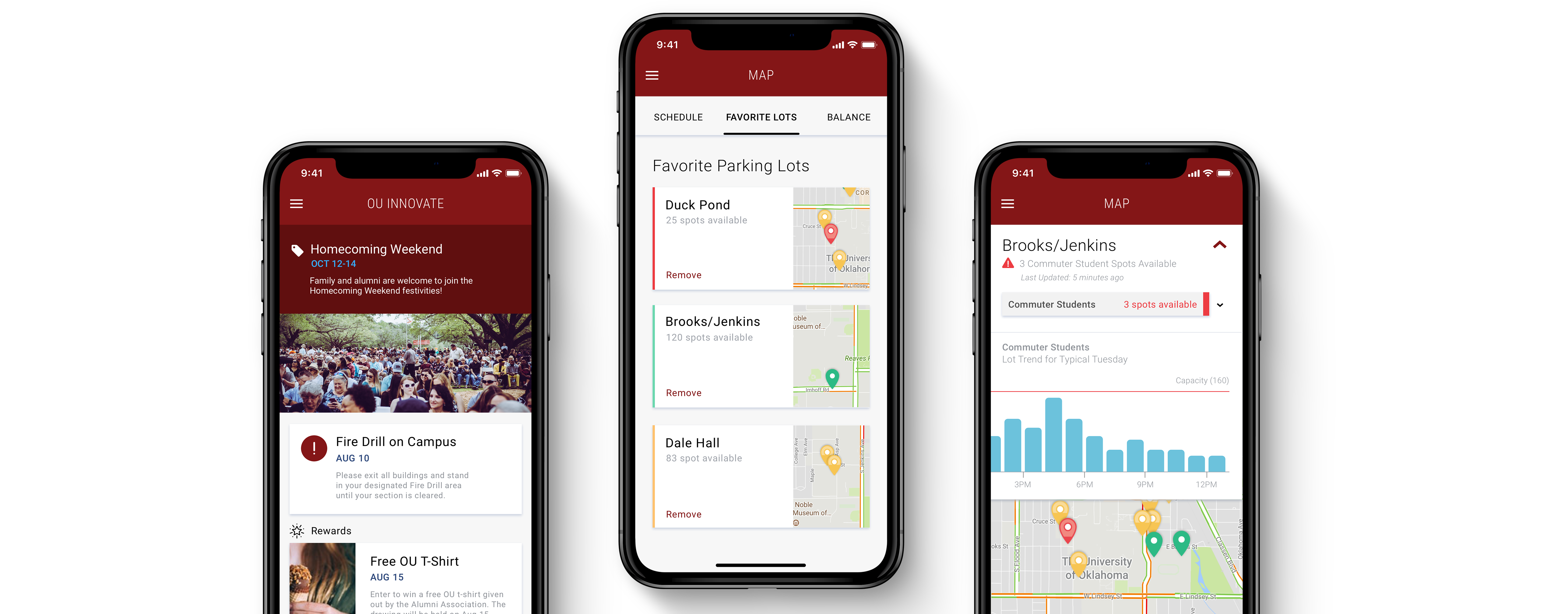
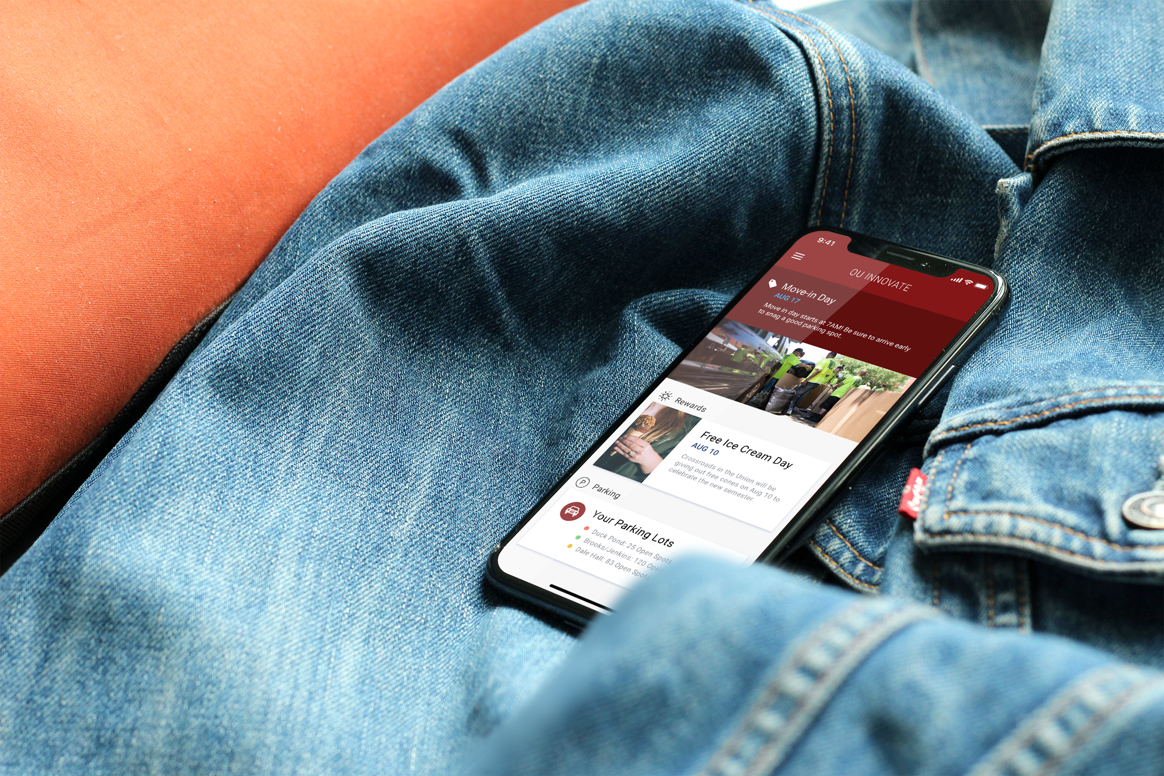
OU Innovate is a an app created by the University of Oklahoma (OU) to test out innovative ways to facilitate students' lives on campus. The app contains features like a Virtual Student ID Card, so students don't need to carry their physical ones, and a Smart Parking Map, where students can see which parking lots on campus have available parking spots. The app also acts as a platform for OU to send out announcements, alerts, and promotions regarding on-campus happenings.
Project Overview
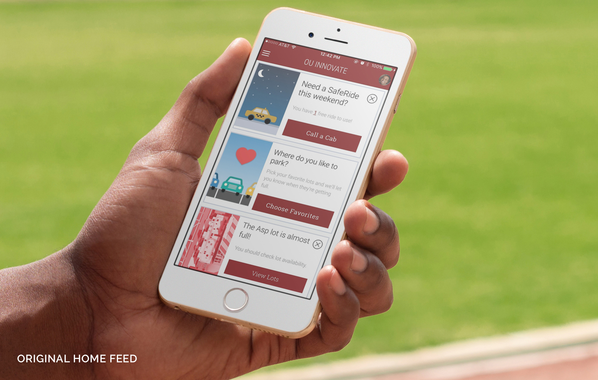
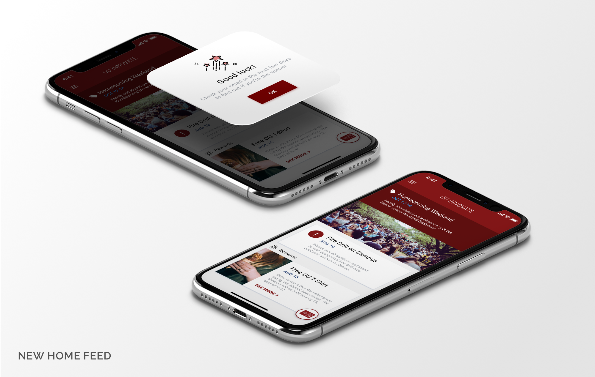
Challenge
The OU team was unhappy with the way the first version of the app turned out. The design was outdated and unappealing, and the functionality was clunky - especially unfitting for an app that boasts innovative technology. For Phase 1, they asked us to focus on 4 main areas of the app to streamline and update: the home feed, the class schedule, and the parking map. For Phase 2, they looked to us for suggestions for future features that could add even more helpful innovation to students.
Solution
Along with giving the app a visual design makeover, we decided to conduct interviews and test the app with current OU students who use the app regularly. The students' feedback would help us find pain points in the current design, and advise us on which new features they would like the most.