User Research & UX Design

Udemy Instructor App

Udemy is an educational marketplace for learning and teaching online courses. Students can master new skills by learning from an extensive library of over 80,000 courses taught by instructors who are masters at their craft. Udemy provides tools which enable instructors to create a course, promote it and earn money from student tuition charges. Udemy instructors create their own content and curriculum, and interact with students who participate in their classes.

revision image

My Role

I worked closely with another UX Designer on Udemy's team on user research and testing, and I lead the charge for working on the app's new design. I produced all major UX and UI deliverables and presented them to the Udemy team between October 2017 and March 2018.

Project Overview

Challenge

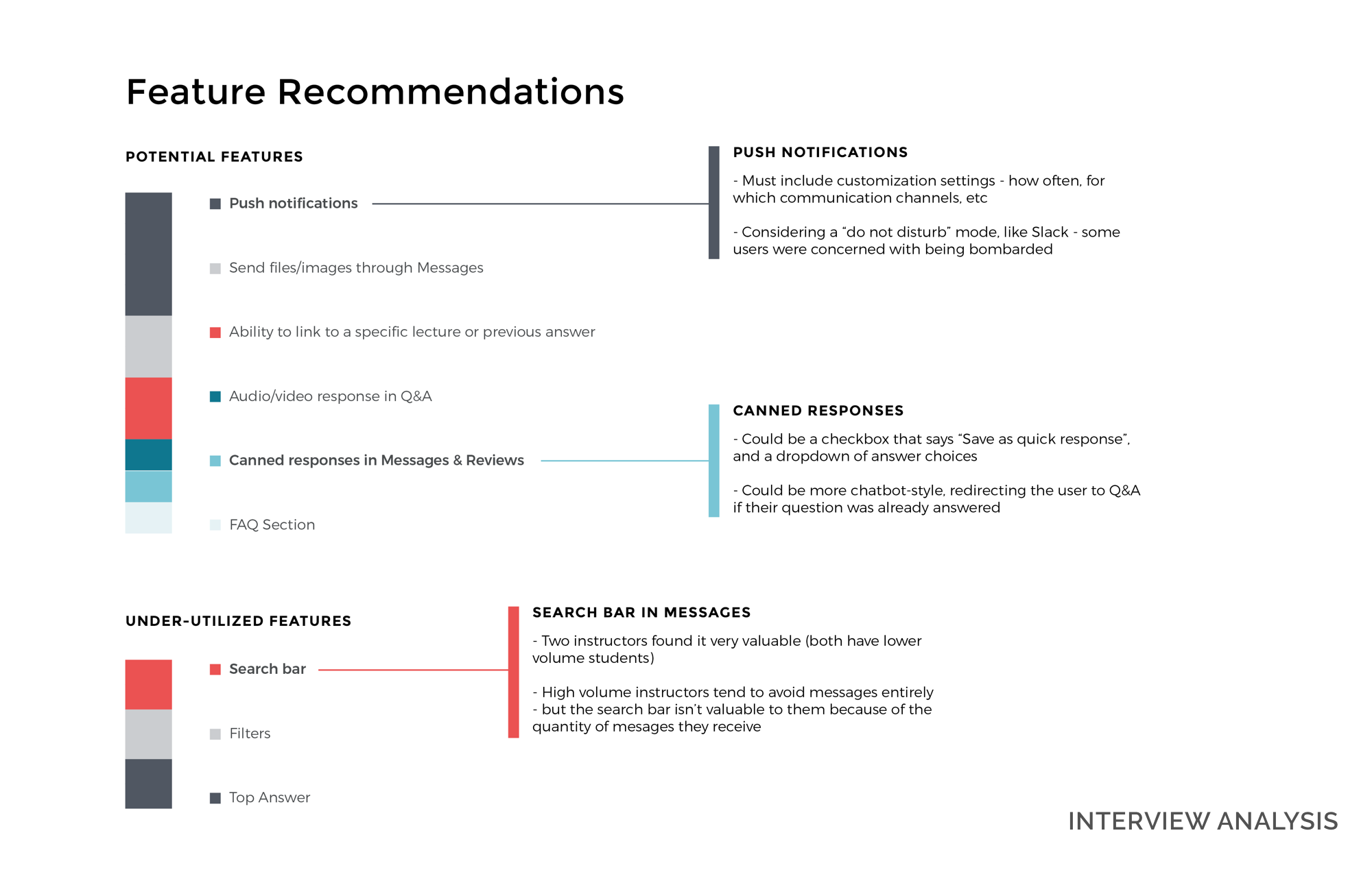
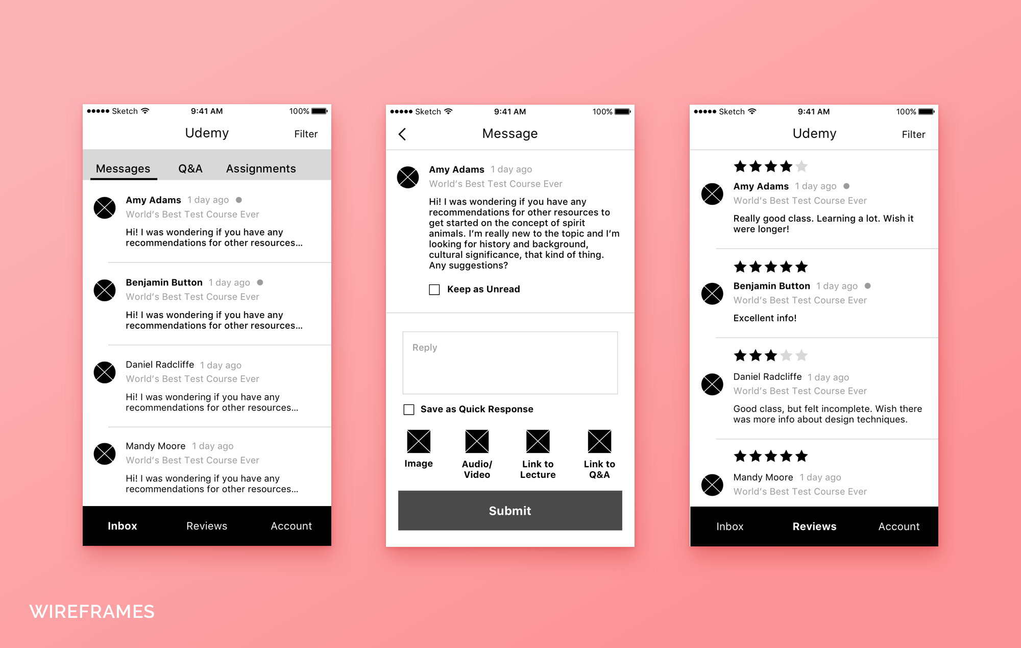
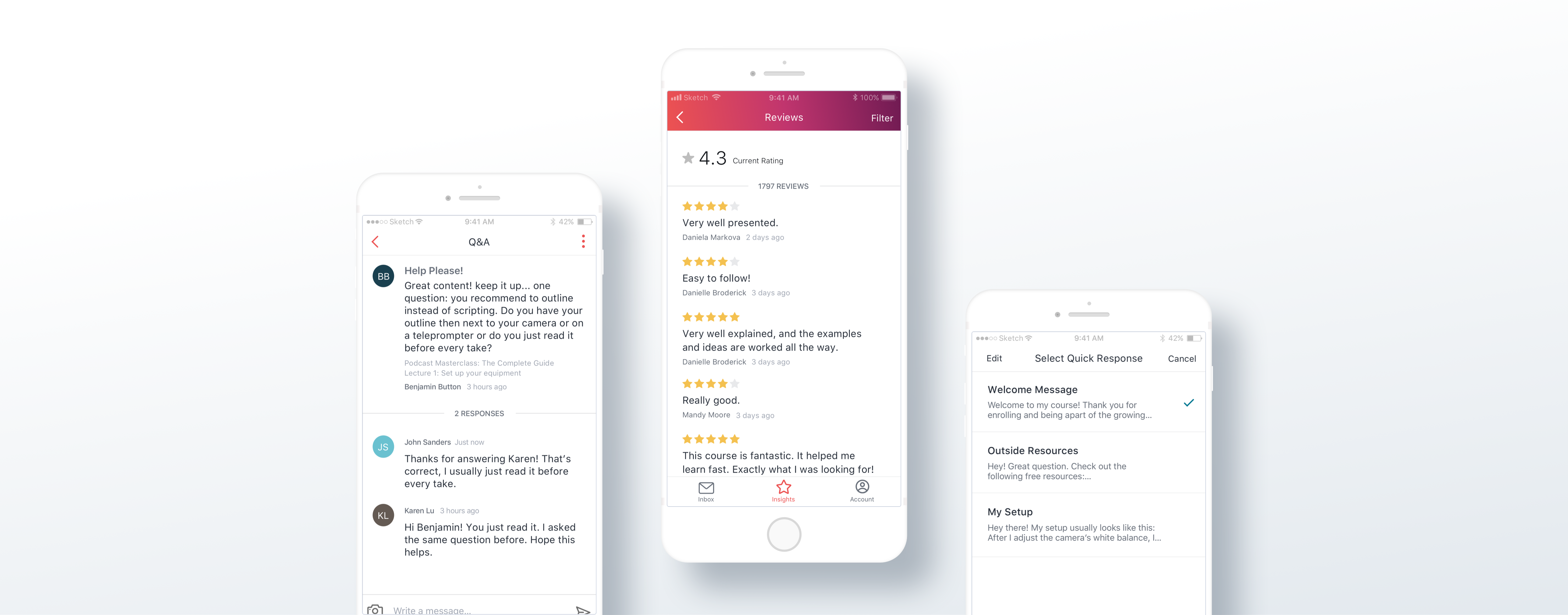
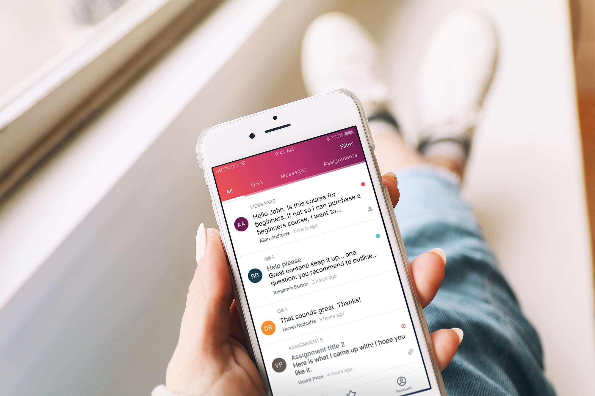
Along with creating a curriculum for their courses, Udemy's web platform allows the instructor to view and respond to their students' posts. However, Udemy's mobile app only supported the student side of consuming content and lacked an instructor login. Our goal was to create the instructor side of the app, which would allow them to communicate with their students via four different channels - direct messages, Q&A, assignments, and reviews.

Solution

As a global platform, Udemy strives to support as many device types as possible. We designed the new instructor side for iPhone, iPad, Android phone, and Android tablet - all in portrait orientation. Since the main action instructors will take in the app is replying to messages and posts, we selected portrait orientation as the best format to display a feed-like list of inbound student questions.

The Approach

In order to create an optimized experience for the instructor, we needed to understand the most common ways instructors interact with their students, how often they interact, and what their workflows are like. The Udemy team booked us interviews with 8 of their current instructors, ranging from some of their most popular ones with tens of thousands of students at a time, to some very niche instructors who have intimate classes of 20 or less. After getting a solid understanding of how instructors communicate with students through Udemy, I built a robust InVision prototype to test with them. We did a round of testing, and I iterated the design accordingly to make a streamlined instructor side that isn't weighed down by feature bloat.

Udemy user interview insights Udemy wireframes

Key Takeaways

  1. During our initial instructor interviews, we found that instructors with extremely large class sizes log into Udemy on their own to check their communication channels. Because their classes are so large, they know they will have new student posts every day and usually check multiple times throughout the day. For instructors with smaller class sizes, they rely on email notifications as an entry point to check their communication channels because they may not receive posts from students every day. This validated our assumption that the ability to customize push notifications would be an important feature for the different levels of instructors.
  2. While interviewing the instructors, we found that many of them brought up the idea of "canned responses". Instructors found that they end up typing the same replies over and over to studnts, and would like the ability to create response templates for common questions that students ask. We built this feature into the app for both direct messages and the Q&A section. We further validated this feature when testing the InVision prototype with instructors. They all reiterated the importance of canned responses to help increase their productivity and save them from typing redundant replies.
  3. Because some instructors like to go into their account and check all communication tabs and some only go into Udemy when they receive a notification from a student, we wanted to account for both workflows on the app's main feed. Keeping this in mind, I drafted a sitemap of the app, displaying how we could utilize tabs to quickly and easily go from viewing all messages to filtering by message type in one tap. Once the sitemap was finalized, I moved forward in designing the UI using Udemy's style guide, incorporating pre-existing components where I could for consistency.
revision image

Final Design

The new instructor side of the app opens up opportunities for instructor to student communication. Instructors can interact with their students without being tied to their desktop computers, and can respond at their leisure. Although instructors with high volume classes and instructors with smaller classes had different needs, the app is streamlined for both user types. Robust filtering and canned responses increase productivity for instructors so they can respond to students quickly and efficiently. Because a mobile app can blur the line between work day and free time, instructors can customize when and how they will receive push notifications.